Jon Denham shows a visitor a row of cubicles at the marketing offices of Kraft Foods in Glenview, Ill. He gestures at the conventional, anonymous beige boxes and asks rhetorically, “How do you think that encourages creativity?”
Then Denham leads the way back to the newly redesigned area for the creative team that he heads, as Kraft Foods’ VP for package design and brand innovation. The desks are arranged four to a cluster, separated by walls that form an X and are low enough to allow communication while seated. Comfortable, low-slung padded chairs with armrest writing surfaces face a whiteboard wall, with soft couches along another wall. Banks of shelves, open on both sides, showcase a variety of interesting packages, not all of them Kraft products-not all of them even food.
This redesign of the creative team’s work area was just completed after 18 months. It’s emblematic of Kraft’s teamwork approach to packaging operations. When you manage an amazingly diverse product portfolio, including some icons that, like the company itself, are more than 100 years old, it helps to communicate your goals and methods for achieving them. It also helps to have clear, generally applicable goals and methods in the first place.
Kraft has done a remarkable job of applying sound principles across its diverse packaging portfolio, and not just in design. In sustainability, use of new technology and other important aspects, Kraft’s packaging consistently stands among the food industry’s best. That’s why Kraft Foods is Food & Beverage Packaging’s 2010 Food Packager of the Year.
Squeezed on Both Ends
Kraft is fighting through one of the biggest economic challenges it has faced in its more than 100 years of existence. Like all branded food companies, it’s being squeezed between increasing ingredient prices and intensifying competition, especially from private label.The balance sheet shows what a struggle it has been. Overall, organic net revenues increased 2.1% in the most recent quarter, but they increased by only 1% for Kraft Foods North America. A company statement cited a “weak consumer environment” and reduced merchandising by Walmart as factors.
To grow in a bad economy among stiff competition, Kraft is buying new brands and strengthening old ones. The former strategy has a higher profile, with the company’s acquisition (finalized at the beginning of this year) of British candy giant Cadbury. The approximately $19 billion deal vastly expanded Kraft’s existing candy brands, many of them European. (It was financed in part by the sale to Nestlé of Kraft’s profitable domestic frozen pizza business.)
Packaging is a vital part of both strategies.
“Part of my charge here is really about contemporizing the company, in terms of its design, look and feel,” Denham says. “It’s a tough charge because we have a lot of No. 1 and No. 2 brands. They’re traditional household names, and they have an established look and feel. You have to discuss where you want a brand to go, and to do that, we created a design language that used conventional design tools but in a more modern way. The toolbox included everything from materials, to shape, to colors, to logo, to typography, to photography. The toolbox was then deployed on our brands to help them realize what contemporary could be within the context of the consumer and the food industry.”
Finding the right place for an iconic brand to go can be tricky. How to keep consumers responding to the brand while refreshing it, hopefully attracting new consumers?
Hania Midura, Kraft’s design director for grocery, says “equity planning and equity analysis” is needed in these cases. “We don’t ever want to step away too far from the brand and what makes it so beloved by our consumers,” Midura says.
A redesign unified Kraft’s macaroni & cheese
offerings while leaving plenty of options for individual SKU distinction.
Using Their Noodle
Perhaps no Kraft brand is more iconic than its Macaroni & Cheese, which underwent a makeover that the design team points to as one of its biggest recent triumphs.One of the immediate challenges in revitalizing Mac & Cheese was dealing with the brand’s disparities. It includes more than 50 SKUs, including the familiar mainstream product, instant Easy Mac and new Deluxe versions. These have different (although overlapping) consumer bases, and the question became how to unify them.
“From our point of view, and from the consumer’s point of view, it’s much easier for us to talk to them about a Kraft Mac & Cheese proposition, as opposed to three or four different brands,” Denham says.
Working with Kraft on the product was design agency Landor Associates. Landor came up with the “noodle smile,” a circular packaging “badge” that features the Kraft logo, the words “macaroni & cheese,” and a simple image of a single macaroni noodle, in the shape of a smile, anchoring the bottom.
This badge now unifies Kraft’s Mac & Cheese line, providing a common frame of reference while allowing plenty of room for highlighting the distinctive properties of each variety. It was supported by an ad campaign that included two giant, two-ton sculptures of the noodle smile, bearing the slogan “You know you love it,” that toured popular locations like Wrigley Field and Navy Pier in Chicago.
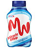
Packaging played a role in making Miracle Whip more edge and appealing to younger consumers.
Cracking the Whip
Another design triumph came with another seeming commodity product: Miracle Whip salad dressing.Denham admits that Miracle Whip had “a slowing history” up to about a year ago. “I think it’s fair to say that Miracle Whip to some degree had lost its relevancy to the consumer, because it didn’t have a distinct point of difference,” he said.
To find that difference, the design team thought about the most appealing aspect of Miracle Whip: the taste. It’s tangier than most mayonnaise, due at least in part to its higher proportion of vinegar to oil.
“It’s got a tang, very different from mayo,” says Carol-Jacqueline Nardi, director of design and innovation for snacks, who had the same position on grocery at the time of the Miracle Whip makeover. “That actually gives it its spark. So as we talk about what’s the right direction to go, that unique product difference is something we leverage, not only in product, but then in personality.”
What emerged, with the help of design firmTurner Duckworth, was a quasi-rebranding of Miracle Whip as “MW,” with a distinctive “ambigram” logo that looks the same upside down. (This is an added advantage when retailers or consumers, as often happens, store the bottles upside down on their broad, flat closures.) The logo formed the basis for a more vibrant graphic scheme, which in turn tied into a youth-oriented ad campaign that stressed the product’s edginess.
“It was a lot more focused on a particular consumer segment who arguably are much more into something that’s a little extreme,” Denham says. “Once you have that clarity of vision, I think it’s fairly easy to come up with something that lives up to that.”
Integration Challenges
Brands that have grown up with Kraft, like Mac & Cheese and Miracle Whip, aren’t the only well-established brands the company seeks to revitalize with packaging. There are also the ones that Kraft buys, the most recent being, of course, Cadbury’s stable of candy and other snacks.Perfecto Perales, Kraft’s senior director of packaging research, is well aware of the challenges involved in a major acquisition. He helped integrate research, development and quality (RDQ) teams from Nabisco Mexico into Kraft when the company acquired Nabisco in 2000. It’s a role he’s looking forward to playing for Cadbury.
“Cadbury has a lot of history of innovation in packaging that we’re excited about, as well as Kraft has some to share with Cadbury moving forward,” Perales says.
As an international company, Kraft is used to sharing technical information across oceans, including but not limited to R&D, design and procurement specialists. As an example, Perales points to a new film used to package chocolate pralines under the Milka and Marabou brands. A Kraft packaging team in Europe developed technology, involving “memory film” cut and scored with lasers, that allow the film to adhere to the curvy surfaces of the bite-size candy for packaging that’s striking, yet easy to open.
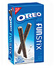
Perales and his team are in search of “transformational technology,” including both new and adaptations of existing technology, that will connect with consumers. As an example, he points to Kraft’s adoption of resealable film for packages for its mainstream cookies, including Oreo and Chips Ahoy!, about three years ago.
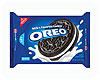
The Snack and Seal package for Oreos and Chips Ahoy! allows easy access and reclosability.
No More Jar
“Through consumer studies, the snacks team learned that our consumers oftentimes would take the previous package and put all the Oreo cookies into a cookie jar, because they couldn’t keep the cookies fresh,” he says. “And so what this technology was meant to do was allow consumers to easily open the package, access the cookies on different usage occasions, contain the product and reseal it.” This also benefits Kraft because when the cookies remain in their packaging, the brand and company associations get reinforced in the consumer’s mind each time he reaches for another Oreo.Figuring out ways to get into consumers’ minds, and stay there, is an ongoing challenge for any packaged goods company. Denham notes that in 1995, there were some 18,000 brands on U.S. store shelves; in 2005, that had ballooned to 55,000.
“When you’re faced with that kind of competitive environment, how do you give the consumer more than just functionality?” Denham asked. “You have to give them something emotional to latch onto that makes a difference.”
New Additions to Kraft's Package Portfolio
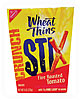
Here are some memorable recent new packages and redesigns from Kraft Foods:A new variety of Wheat Thinscomes in a paperboard carton designed to convert into a serving “bowl.” Wheat Thins Stix, a round, thin version of the established cracker, is packaged in a carton that tapers toward the bottom. When all four top flaps are folded down and the carton is squeezed according to directions on the side, it becomes a wide-mouth bowl-like package that allows easy access to the product.