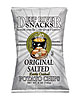
A revamp of packaging graphics for Deep River Snacks emphasizes the wholesome nature of the formulation while maintaining a colorful presentation.
How do you make consumers feel good, or at least less guilty, about eating salty snacks?
Get back to basics.
Like many foods high in fat and carbohydrates, fried snacks like potato chips have a relatively short shelf life that can’t be extended by preservatives. That, plus the inherent simplicity of the formulation (potatoes, oil and salt), gives them a natural appeal-literally.
Stuart Leslie, president of the design agency 4Sight, recalls eating a bag of Lay’s Potato Chips while his wife snacked on SunChips, both from Frito-Lay.
“She was telling me, ‘How can you eat that stuff?’ And I said, ‘Well, you read your ingredient list, and I’ll read mine.’ And she was shocked,” Leslie says. “When you look at what’s in the ‘healthier’ foods, especially when you get into artificial sweeteners and preservatives, you end up with an ingredient list that you have to be a chemist to figure out what you’re eating.”
Lee Sucharda, president of the Design North graphic/design firm, echoes that sentiment, noting that taste is always the No. 1 consideration for salty snacks, but the benefits of a simple ingredients list are becoming a close second.
“They work on their taste profile first, and then what they try to do is create a really simple ingredient deck which helps consumers to believe that there’s none of these bad things in there that you can’t pronounce,” Sucharda says.
Frito-Lay is well aware of that phenomenon. Its CEO, Indra Nooyi, recently told a Fox Business Network interviewer that Frito-Lay’s Doritos tortilla chips are “nothing more than corn mashed up, fried up in oil, and flavored in the most delectable way.” She’s used a similar “potatoes, oil and salt” line about potato chips.
“The consumer is starting to move toward simplicity of ingredients, and that’s real easy to work with from a packaging standpoint, too,” Leslie says. “If you start with something that’s simple at its core, then you can design packaging that really reinforces that to the consumer.”
Frito-Lay, as the category leader, is in a unique position to capitalize on that. The packaging graphics for its flagship Lay’s Potato Chips play up the product’s simplicity: They depict a whole potato transitioning into slices, then into chips, all against a sunny yellow background.
How to say ‘simple’
Smaller competitors are adopting similar tactics. Simplicity and naturalness can be expressed through various means: retro graphics/typography, an uncluttered front panel, a white or light-colored background, a kraft paper-like material or shade, a matte finish. It also helps to make health claims like no trans fat or no cholesterol.
One example is Deep River Snacks, a salty-snack processor based in Old Lyme, Conn. Its redesigned graphics, rolled out in January, play up the “natural” trope, with the Kettle Cooked Potato Chips featuring a drawing of potatoes (one of them sliced) in front of a steaming kettle of oil, rendered in an old-fashioned style that’s almost like a woodcut.
Debbie Bardin, marketing director for Deep River Snacks, says that playing up the simplicity and “naturalness” of salty snacks makes it easier, in a way, for consumers to indulge.
“I think the main reason [for the “natural” trope] is that, when people are going to indulge, they’re going to indulge, but the consumer today still wants to choose wisely,” Barden says. She points to Deep River’s introduction of multigrain tortilla chips at the beginning of this year: “If you can have a tortilla chip that tastes as good or better then a Dorito, yet it is all-natural, doesn’t have all the dyes and preservatives, and it’s a multigrain chip, yet you’re still going to be satisfied and have that flavor, why wouldn’t you choose something healthier?”
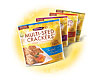
Packaging for multigrain crackers combines better-for-you claims with bright colors and appetizing product shots.
No clichés, please
Some of the graphic elements used to present a “natural” message have been used so often that they’re in danger of becoming clichés. Deep River avoided that by retaining the bright colors and other standout elements of its previous packaging.“Everybody seems to be going more towards the white package that has maybe a picture of the ingredients on it,” Bardin says. “We still wanted to stand out in a crowd. We’ve always had very good feedback to our packaging because people could resonate with the colors related to the different flavors, that they were bright and cheerful, and we didn’t want to lose that aspect. We are a more gourmet chip, but we wanted to have fun at the same time. We don’t want to just completely follow the trend of, ‘Hey, let’s just throw a picture of a potato and rosemary and a bottle of olive oil’ because those are the main ingredients.”
Sucharda says getting noticed on the shelf is always a top priority for any package design, which makes it necessary to break away from clichés.
“If everybody else in that category is in an earth tone, uncoated stock, trying to really play up the all-natural [angle], then we would say let’s not do that,” Sucharda says. “Let’s take more of a mainstream approach and really ensure that we get noticed in this category. And then once we get noticed, let’s really give consumers a reason to pick our brand over the competition, so let’s tout the natural qualities of this product.”
Design North has put this strategy into practice with two of its clients. Both Snikiddy baked fries from Snikiddy LLC, Boulder, Colo., and Crunchmaster crackers from TH Foods Inc., Loves Park, Ill., use bright yellow backgrounds and appetizing photos (in Snikiddy’s case, reminiscent of the paperboard container for fast-food fries) to spike shelf appeal. They play up the better-for-you aspects with verbiage like “Gluten-Free,” “100% Whole Grain,” “All-Natural” and-in the case of Snikiddy-“Have a Healthy Day.”
Leslie notes that simplicity has become a selling point for all sorts of consumer products, ranging from food to electronics. Fried snacks are a natural fit for that trope.
“Your overall perception of it is, it’s simple, it’s approachable, it’s friendly, it’s familiar,” Leslie says. “It’s something that I can like easily and not have to get used to. And so that fits in hand-in-hand with a product that’s already that way from its ingredients.” F&BP