
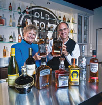
Brown-Forman uses subtle design cues to maintain the cachet of its established brands while still keeping them fresh. Lynn Wilkinson, senior VP and director of production services and supply chain, teams up with Eric Doninger, VP and director of global design services. (Photo by Vito Palmisano)
Much of Brown-Forman’s packaging is like its whiskey: mature, mellow and subtly improved over time.
by Pan Demetrakakes, Editor
There’s plenty of good news to toast at Brown-Forman. And there’s plenty to toast it with.
When it comes to good performance in bad economic times, Brown-Forman has as much to be happy about as anyone. The $3.2-billion alcoholic beverage company has enjoyed, in liquor and wine, a compound annual growth rate of 10% in net sales and 12% in operating income since 2004. In the most recent quarter, it posted a 38% rise in profit, even as net sales declined slightly.
Brown-Forman manages a product portfolio that ranges from long-established, iconic brands like Jack Daniel’s and Southern Comfort, to relatively new products and recent acquisitions like Herradura Tequila (purchased in 2007). The company has maintained and energized the packaging for its established products, while coming up with innovative packaging for its newer ones. Its success in keeping its packaging fresh and vital, yet supportive of its established, upscale brands, has led to Brown-Forman being namedFood & Beverage Packaging’sBeverage Packager of the Year.
Lynn Wilkinson, senior VP for production services and supply chain, says uniqueness is one of the greatest current packaging imperatives.
“I’ve been involved in packaging from the production side for many years, and I’ve seen the pendulum swing from looking for the lowest-cost package, where every package looked alike, to every brand wanting its own unique identity,” Wilkinson says. “The package is really a major marketing tool-a way to reach the consumer.”
Eric Doninger, VP for production services and supply chain, agrees that upscale looks are an important goal.
“We’re trying to make the package look as good as possible, whether that’s enhancing materials, whether that’s enhancing structure, whether that’s enhancing the way it feels in your hand,” Doninger says. “The premiumization of brands is something we’ve looked at a lot recently.”
Conventional wisdom has it that liquor, especially premium liquor, is supposed to be recession-resistant. That’s proving to be only partially true. According to data from Nielsen, sales of spirits are up 2% for the 52 weeks ending Sept. 5. However, the Nielsen report added that consumers are trading down, leading to a surge in sales of domestic liquor at the expense of costlier imports.
Another recession-related trend involves at-home consumption. Consumers are eating out less and at home more, and the same goes for drinking. In the Nielsen survey, 59% of respondents said they don’t go to bars as often lately. This shift probably accounts for a 3% drop in on-premise sales of spirits, as reported in the 2009 handbook of the Beverage Information Group.
These trends have, of course, shaped Brown-Forman’s thinking about both product development and packaging.
“Consumers now are interacting more with our package on the store shelves, whereas in the past, many consumers interacted via a bartender, looking at our package at a distance on the back bar,” Doninger says. “Now they’re getting much closer to the packages and actually interacting with them, in their hand, in the stores.”
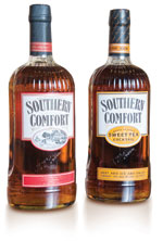
The packaging for Southern Comfort premixed cocktails (left) is almost identical to regular Southern Comfort, with the main difference being the product identification in the center oval.
Mixed in the bottle
Ready-to-drink mixed beverages are among the products that seek to take advantage of the at-home trend. A recent addition to this lineup was Southern Comfort, the iconic whiskey-based liqueur, as the basis for premixed Sweet Tea and other cocktails. The packaging challenge was to make sure the consumer associated the product with Southern Comfort, but still realized what it was and what was in it.“We took some of those iconic and familiar details [from Southern Comfort’s labeling], but tweaked them just a little bit,” Doninger says. The typography, border elements and general label design remained the same, including the oval at the center. But inside that oval, Doninger and his team substituted the product name for the Currier-and-Ives-style engraving that appears there on the regular Southern Comfort label.
One of the most comprehensive recent packaging changes was to Gentleman Jack, a premium line extension of Jack Daniel’s. The new bottle, brought out last year, has a more contemporary, flask-like appearance, with rounded shoulders and smaller graphics that use an engraved-plate motif.
“From a design perspective, it’s one of our most important [recent] achievements,” Doninger says. “It’s clearly taken the brand, Gentlemen Jack, and introduced it in a more contemporary way, but yet still used the platform of the Jack Daniel’s equity.”
Most of the package design changes to Brown-Forman bottles are more subtle, involving changes to typography, label shape or color, closure shape and other secondary cues. The company’s goal, especially with its established, upscale brands, is to refresh the packaging in ways that enhance consumer perception without disrupting it.
“We tend to think that the packages we design really are never finished,” Doninger says. “They’re continuing to evolve and move along a path. What we’ve been trying to do with many of the brands is think in terms of a long-term design strategy, and there are many steps along that path. So even though a consumer might not notice, specifically, what might be a move or a design change from step 1 to step 2, as those subtle changes continue to evolve, they might look back five or ten years and say, ‘What a dramatic change,’ although we’ve made those in very small steps.”

One of the more comprehensive packaging revamps has been for Gentleman Jack. The new bottle (right) is more flask-like, with distinctive rounded shoulders.
An integrated look
Under a policy that Brown-Forman instituted about three years ago, packaging changes are now considered as part of a general design strategy. They’re integrated with other functions, including advertising in all its forms, like point-of-sale displays, exhibits and special promotions.“Now we have sort of a cross-functional team and mixed lots of people up, so we have package designers that used to focus only on packaging working on some exhibit design,” Doninger says. “Or they might be working on some graphic design. And graphic designers might be working on label graphics, and things like that. It takes a long time to educate folks about various brands, and so we wanted to make sure we had a consistent look and feel across brand communication points.”
In the past, Doninger says, the design elements of brand identity-typography, logos, color palettes, and so on-were driven by packaging revamps. Now, it’s the opposite: Brand identity is established and evaluated first, and packaging is just one of the brand aspects that it affects.
“It goes back to the goal of trying very hard to make sure that our brands speak clearly and consistently across all the different avenues, whether that be on an outdoor billboard, in a magazine ad, or on a retail shelf, on a label graphic,” Doninger says. “We want to make sure a consumer of ours says, ‘Yes, that all feels the same.’”
There are other imperatives that drive packaging changes, especially label changes. Regulatory requirements are among the biggest, especially given Brown-Forman’s global operations. Sales outside the United States amount to just over half of the company’s total, which means there has to be room on the bottles for, say, British or Russian tax stamps, or the ingredient listings that some other countries require. Label design also has to keep up with changing domestic regulations, such as the possibility of a Nutrition Facts panel being required for alcohol.
“When you’re spreading to new markets, the challenge is making sure you understand labeling regulations and having the space on the bottle-something that Eric and I always talk about with the design,” Wilkinson says. “I’ve got to have space for all these challenging mandatory elements that have to go on the label overseas. The requirements on labels overseas are much broader than in the U.S., although I think they’re coming in the U.S. too. I’m sort of like Eric’s conscience on that-‘Eric, leave me label space. We have to have label space.’”
Consistency is a challenge when a product is produced in multiple locations. Some of Brown-Forman’s flagship products, like Jack Daniel’s whiskey and Finlandia vodka, are produced in only one location, but others, like Southern Comfort, are distilled in multiple facilities.
“It’s a global brand, so the package is the same globally,” Wilkinson says. “But when we make a change to it, instead of one location and one set of change parts, we’re looking at multiple locations and change parts, and trying to coordinate a major packaging change around the world.”
Packaging changes at Brown-Forman, but most of the time, they’re like the changes that bourbon undergoes in a barrel: slow, organic and subtle.
“I think of packaging as one of the components of the brand that might change the least often,” Doninger says. “Packaging is [a factor] that will live past the current economic cycle. Luckily, with a portfolio like Brown-Forman has...we look at the longer-term aspects of the brand identity and the packaging.”