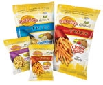
The design for baked snack fries uses photography to
emphasize their indulgent aspect, and graphics to underscore the wholesomeness
of the ingredients.
,br> Processors of all kinds of foods and beverages are trying to appeal to consumers by stressing how their products are wholesome, natural, close to the Earth, etc. Some make the tightly regulated claim of organic or the unregulated (in the U.S.) claim of natural. Others emphasize the basic nature and/or minimal processing of their products, like the Lay’s Potato Chips graphic that shows a whole potato transitioning into slices, then chips.
It’s a vital market. There were 1,883 new food products making “all natural” or “organic” claims introduced in the U.S. in the 12 months ending in August, up from 1,556 in the preceding 12 months, according to Mintel’s Global New Products Database.
How can packaging help?
Packaging designers say that certain verbal and visual cues, and in some case certain packaging materials, can help reinforce the idea of wholesomeness or naturalness. But as with any package design, it’s important both to avoid clichés and to make sure other essential elements of the marketing message don’t get overlooked.
Taste is one of the biggest such elements, especially since healthy foods have a collective reputation for being less than scrumptious.
Taste still important
“One of the hurdles you have to get over with consumers is that they want to eat healthy, but they won’t sacrifice taste in most cases to do it,” says Lee Sucharda, president of package design firm Design North.One of Design North’s clients is Snikiddy LLC, Bethesda, Md. Design North recently redesigned several Snikiddy products, including a line of Snikiddy Baked Fries. The packaging graphics combine a shot of the product flowing from a fast-food-style paperboard pocket with a drawing that represents the ingredients (whole potatoes, an ear of corn symbolizing corn oil, and cheese or ketchup as the flavoring). The idea is to emphasize the simplicity of the ingredients.
“Showing the real potatoes, the real cheese, the real corn, even though it’s an illustration, it does imply that that’s what it’s made of,” says Gwen Granzow, VP and creative director at Design North. The healthy/natural message is reinforced with verbiage, including “All Natural” in large letters and a “dashboard” across the top spelling out health benefits.
It’s a question of prioritizing the message, Sucharda says: “We don’t necessarily migrate to the expected, using matte finish or earth tones. We tend to look into what will get noticed first, and then once you get their attention, we really focus on the hierarchy to deliver on that message.”
No clichés, please
Avoiding the expected is one of the principles of Pure Branding, a design firm that specializes in packaging for natural/organic products. The niche has been around long enough by now to have generated its own clichés.“There’s been exploiting of the elements of natural design to the point where now consumers are jaded,” says Kevin Williams, principal brand strategist with Pure. “They know a lot of brands have taken advantage of this. You can put a kraft wrapper something and say that it’s natural. So they know that they’ve got to elevate the conversation, so that they’re really speaking to what the brand stands for.”
In fact, the very lack of design cues can itself be a design cue, denoting simplicity and wholesomeness, Williams says.
“There’s this knee-jerk reaction or mindset of putting as much on the package as possible,” he says. “As many claims, as many attributes, as many things as you can possibly fit. I would be the first to say from a design standpoint that leaving a little bit of empty space [on the package] can be your strongest proposition, because you’re allowing your most important aspects to start to come through.”
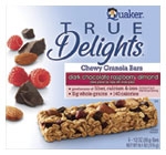
Quaker combines a “beauty shot” with shots of the
ingredients that underscore the better-for-you nature
of the product.
Simplicity and sincerity
Peter Clarke, CEO of design firm Product Ventures, agrees that simplicity is useful. He says it can denote sincerity, which consumers perceive as something in short supply these days.“Another big movement that’s going on is simplicity, which really is borne from this lack of trust that consumers have with everything that’s going on, with recalls, issues with contamination, environmental disasters like BP,” Clarke says.
As a consequence, Clarke suggests altering the “beauty shot” strategy of using a gorgeous product photo as the main graphic element: “With this lack of trust consumers have, they’re not going to really buy the beautiful photograph.” If you use such a shot, Clarke suggests, include other elements like ingredients. Clarke points to True Delights granola squares from PepsiCo’s Quaker unit as a good example. Alongside the product are elements denoting the ingredients, such as bits of chocolate and fruit.
Williams says that natural/organic products often have a compelling story to tell, and that simplicity in design can deliver that message more forcefully. As an example, he cites Pure Branding’s work for Organic India USA, Boulder, Colo.
The conventional wisdom for marketing tea is to play up its “exotic” aspects. But that’s not good enough for contemporary consumers of natural and organic foods, Williams says: “Just to create this illusion of exotic wasn’t sufficient. You needed to be true to what this brand represented, which was supporting the lifestyle and supply chain of the people and creating good in the world.”
Pure developed packaging that included photos of Indian farmers, accompanied by a narrative about how organic tea farming brought more prosperity to their villages. He cited this as a way “to elevate the conversation, so that [packages are] really speaking to what the brand stands for.”
Clarke sees natural/organic products as benefitting from environmental awareness and other, related trends.
“All this stuff is kind of dovetailing together-the sustainability movement, the natural/organic need for more unaltered [products], the locavore movement,” he says. “It’s enabling packaging systems to change to fit the needs of consumers and not be so mass-produced and artificially based. Things coming more full circle-we’re kind of going back to where we came from, in a way.”
For more information
Design North262-898-1090;www.designnorth.com
Product Ventures
203-319-1119;www.productventures.com
Pure Branding
413-548-9900;www.purebranding.com